What you’ll learn
- Why a patient monitoring dashboard needs two different interfaces sharing one data stream, not one screen serving both audiences.
- Where alarm fatigue and false-positive fatigue come from, and how UI decisions either feed or reduce it.
- What HIPAA-compliant design means in practice, beyond encryption sitting quietly in the backend.
- How to evaluate a vendor’s patient monitoring UI UX design services before committing budget to a build.
A cardiac nurse once told a colleague of ours that she’d stopped trusting her own monitoring console. Not because the data was wrong, but because the console couldn’t tell her which of fourteen active alerts actually needed her attention next, so she’d learned to triage by instinct instead. That’s not a rare complaint. It’s the default outcome when a monitoring product gets built around what a sensor can capture rather than what a clinician, or a patient at home, can actually act on. Real patient monitoring UI UX design services start from that gap, not from a component library.
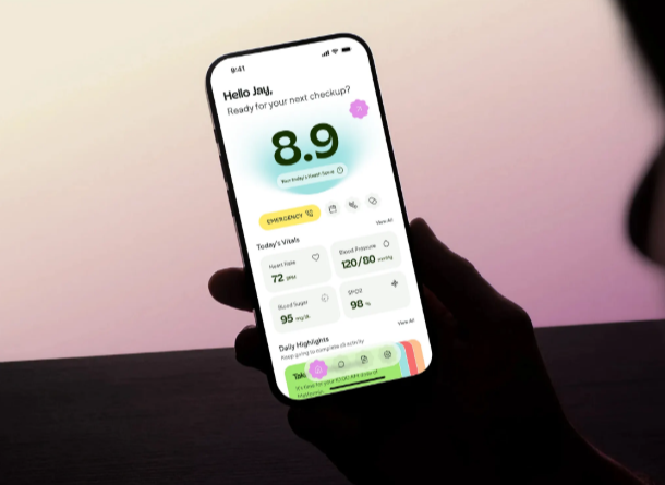
The same failure shows up on the patient side of the product, just quieter. A patient managing a chronic condition at home doesn’t need fourteen data points on a single screen. They need to know, in plain language, whether today’s reading is fine or whether they should call someone. A dashboard built for a clinician’s depth of context, handed to a patient without translation, produces anxiety instead of reassurance, which is the opposite of what remote monitoring is supposed to deliver.
One data stream, two very different interfaces
Most patient monitoring products get this backwards early. A team builds one flexible dashboard, assumes role-based permissions will handle the difference between a clinician view and a patient view, and ships it. Permissions control access, not cognitive load, and cognitive load is the actual design problem. A clinician reading a continuous glucose trend needs granularity and historical comparison. A patient reading the same trend needs a single clear signal and a next step. Serving both from the same visual language, with fields merely hidden for the patient view, rarely satisfies either one.
Good patient monitoring UI UX design services treat these as two products sharing one data pipeline, designed against two separate sets of decisions. The clinician surface optimizes for speed under high alert volume. The patient surface optimizes for clarity under low health literacy and, often, real anxiety about their own condition. Conflating the two is the single most common structural mistake we see in this category, and it’s usually invisible in a demo, since a demo rarely simulates fourteen simultaneous alerts or a scared patient reading their own numbers at 2 a.m.
Why alarm design is a UX problem before it’s an engineering one
Alarm fatigue is well documented in clinical settings, and it’s a design failure as much as a threshold-tuning one. A monitoring interface that treats every out-of-range reading with the same visual and audible urgency trains clinicians to tune out alerts entirely, the exact opposite of the safety goal. Differentiating true urgency from routine variance, visually and not just numerically, is core UX work, not an afterthought added after the sensor logic ships.
Remote monitoring adoption has moved fast enough that this problem now extends well past hospital walls. Telehealth and connected-care usage settled well above pre-2020 levels, so interfaces once built for a nurses’ station now have to work just as well on a patient’s phone, often with no clinician nearby to interpret an ambiguous reading.
According to McKinsey research, telehealth use has stabilized at roughly 38 times its pre-pandemic level, a shift that pushed a large share of monitoring and follow-up work out of the clinic and onto patient-facing screens. (McKinsey & Company)
That shift raises the stakes on interface clarity. A confusing chart in a hospital setting gets clarified by a nearby nurse. On a patient’s phone at home, it often doesn’t get clarified at all, it just gets ignored, or misread into a decision the patient shouldn’t be making alone.
Your browser doesn’t support embedded video.
HIPAA-compliant design means more than an encrypted database
Compliance conversations in this category tend to stop at infrastructure: encryption at rest, encryption in transit, access logging. Those matter, but HIPAA-compliant design has a visible layer too, one most vendors underinvest in. Who can see which fields, under what role, needs to be legible in the interface itself, not just enforced silently on the backend. A clinician switching between patients mid-shift needs unambiguous confirmation of whose record is on screen. A misread patient identifier at a glance is a patient-safety issue wearing a UX costume.
The same logic applies to consent and data-sharing screens on the patient side. A patient authorizing a family member or a second provider to view their monitoring data needs to understand exactly what they’re granting, in language a compliance document was never written to provide. Translating a legal permission structure into an interface a nervous, possibly unwell person can parse correctly on the first read is specialized work, closer to mobile app and web design than to general software UX.
Designing for mobile apps and web platforms as one connected system
Patient monitoring rarely lives on a single surface. A clinician typically works from a web dashboard with a larger screen and more simultaneous context. A patient typically interacts through a mobile app, sometimes paired with a wearable feeding data in continuously. Treating mobile app and web design as two disconnected builds, handed to two different teams, is where most inconsistency creeps in: a status label that means one thing on the web console and something subtly different in the mobile app, a color code for urgency that isn’t shared across both surfaces.
Wearable data volume is only growing, which raises the cost of that inconsistency every year a product stays in the market without addressing it.
Deloitte Insights projected that global shipments of consumer health and wellness wearables would reach nearly 440 million units, up from roughly 320 million two years earlier, as more healthcare providers built those data streams into standard monitoring workflows. (Deloitte Insights)
A monitoring product that ingests wearable data without coherent mobile app and web design tying the capture surface, the review surface, and the alerting logic together will eventually show that seam to a clinician or a patient, usually at the worst possible moment. Consistent design tokens, shared status vocabulary, and a single source of truth for what “urgent” looks like across every surface aren’t polish. They’re patient safety infrastructure with a visual layer.
Oleksandr Kostiuchenko, marketing manager at Phenomenon Studio, notes that the monitoring projects that stay stable after launch are rarely the ones with the most sophisticated sensor integration. They’re the ones where clinician-facing and patient-facing interfaces got designed against the same alert taxonomy from day one, rather than reconciled after each was already built separately. Retrofitting shared logic onto two interfaces that grew up apart, in his experience, costs far more than building that alignment in from the first sprint.
Implementation timeline and delivery risk worth planning for
None of this planning matters much without a team that treats patient monitoring UI UX design services as a discipline with its own delivery rhythm, distinct from a standard product build. Teams that source patient monitoring UI UX design services from a generalist vendor without that rhythm built in tend to discover the gap only after the first phased release slips.
Teams comparing web design services quotes should expect phase-based proposals rather than a single fixed number, since compliance findings routinely reshape scope after the first review. A provider offering narrow web design services for just the patient app, without visibility into the clinician side, will miss dependencies that only show up once both surfaces are built together.
The same applies to the console itself: a website development company scoping the web dashboard in isolation from the mobile release tends to underestimate how much rework a shared design system requires later, and a website development company that hasn’t planned for that rework upfront usually passes the cost on mid-project instead.
A mobile app development company staffing this work needs bench strength in both continuous data handling and compliance-aware interface design, not just general app development experience. Confirm a prospective web development agency has coordinated a phased rollout before, since patient monitoring products rarely launch every feature at once.
A website design services engagement scoped only around the patient-facing marketing pages, separate from the clinical product itself, risks a visual mismatch between how the product is marketed and how it actually behaves once a patient logs in. Buyers should confirm any website design services proposal accounts for that handoff explicitly. A web design agency proposing to handle only the patient app’s visual layer should explain how it will stay aligned with whichever team owns the clinician console, since one vendor rarely owns both halves of this kind of build alone.
A UX design agency evaluating this kind of project should be asked directly how it plans phased delivery around a compliance review that hasn’t happened yet. Mobile app development services quoted separately from the web platform build should still map to one shared release calendar, so alert logic changes land on both surfaces at the same time rather than drifting apart between releases. Coordinating mobile app and web design under one release calendar is the clearest way to prevent that kind of drift, and it’s worth asking any shortlisted partner to describe exactly how they manage it day to day.
Common mistakes in patient monitoring interface projects
- Treating the patient view as a stripped-down clinician view. Hiding fields isn’t the same as redesigning for a different cognitive load and a different level of health literacy.
- Uniform alert styling regardless of urgency. When every out-of-range reading looks and sounds the same, clinicians learn to distrust the system rather than the individual alert.
- Compliance treated as invisible infrastructure only. Permission boundaries that aren’t legible on screen create the same risk as permission boundaries that don’t exist, since a clinician can’t act on a rule they can’t see.
- Mobile app and web design treated as two separate projects. Status labels, color codes, and urgency logic drift apart the moment two teams build the two surfaces without a shared design system.
- No plan for wearable data volume growth. A dashboard that handles today’s data rate cleanly can become unreadable within a year as more devices feed into the same monitoring stream.
- Usability testing limited to healthy volunteers. A monitoring interface tested only on people without the condition it’s built for misses exactly the confusion and anxiety patterns it needs to solve for.
What to ask before choosing a design and development partner
A team evaluating vendors for this work benefits from sharper questions than a general capability pitch answers. Ask whether the shortlist offers web development services that extend through a live clinical or home-monitoring launch, not just a design handoff. Confirm a candidate website development agency has shipped a compliance-heavy healthcare flow before, since general portfolio work rarely surfaces this category’s specific failure modes. A provider offering broad web design services should be able to show how a permission structure becomes visible on screen, not just described in a compliance document.
If the product spans both a clinician console and a patient-facing app, ask how a mobile app development company under consideration coordinates its web app development work with the mobile build, since the two surfaces need one shared vocabulary for status and urgency. A website development company quoting the web dashboard separately from the mobile app should explain, concretely, how the two teams stay synchronized on alert logic through the build. The same question applies to any UI UX design services vendor proposing to handle only the interface layer while a separate partner owns the data pipeline underneath it.
Pricing and process questions matter here more than in most categories, because scope tends to expand once real compliance requirements surface mid-project. A web development agency pricing the entire build as one fixed number before a compliance review is pricing around an assumption that rarely holds. A web design agency or a narrower website design services provider working in phases tends to absorb that uncertainty more gracefully, since scope changes get renegotiated at each boundary rather than triggering a dispute later.
Ask a UX design agency how it validates alert comprehension with real patients and real clinicians, not just internal reviewers who already understand the product’s logic. A UX design agency that only reports task completion rate is measuring whether someone can find a button. One that also tracks hesitation and misreads on urgent alerts is measuring whether the interface is actually safe to deploy.
Confirm whoever owns mobile app development services on the account has handled continuous background data streams before, since that behaves very differently from a typical consumer app. If a companion clinician dashboard is planned later, ask whether a mobile app development agency being considered for that phase can walk through a past handoff between a mobile team and a web team. If visual identity work is still open, ask whether the partner works directly with branding companies or manages that in-house, since a monitoring product’s visual language has to read as clinical and trustworthy without feeling cold to a patient managing a health scare at home. That same branding companies question is worth revisiting once the product expands past its first release.
Website development agency selection deserves the same scrutiny on the web side specifically. Confirm the team proposing the website development agency role has designed a role-based dashboard before, where the same underlying data legitimately needs to look different depending on who’s viewing it.
Your browser doesn’t support embedded video.
The standard worth holding this work to
Patient monitoring interfaces don’t get judged on visual polish first. They get judged on whether a clinician trusts the alert enough to act on it immediately, and whether a patient reading their own data at home understands, without a phone call, whether they’re safe. Every design decision in this category, from color coding to permission visibility to how mobile and web surfaces stay aligned, ultimately serves one of those two outcomes. A product that gets the aesthetics right but misses either one hasn’t solved the actual problem, no matter how clean the component library looks in a pitch deck. Every phase of patient monitoring UI UX design services work, from the first wireframe to the third release, should trace back to those two outcomes.
The cost of getting this wrong rarely shows up during development. It shows up months later, in alert fatigue nobody planned for, a compliance review that forces a late rebuild of approved screens, or a patient who stopped trusting their own dashboard and quietly went back to guessing. Building the clinician and patient experience against one shared logic from the start costs about the same as building them separately and reconciling the gaps afterward. It just requires deciding that alignment matters before the first screen ships.
Frequently asked questions
Why can’t a patient monitoring dashboard use one interface for both clinicians and patients?
Because the two audiences need different things from the same data. A clinician needs depth and speed under alert volume. A patient needs a clear signal and a next step, without the cognitive load of full clinical context. Hiding fields for the patient view doesn’t solve that, since the underlying logic still assumes a clinician’s reading habits.
What causes alarm fatigue in monitoring products, and can design fix it?
Alarm fatigue often comes from uniform alert styling, where routine variance and true emergencies look and sound identical. Differentiating urgency visually and audibly, based on real clinical thresholds, is a design decision as much as an engineering one, and one of the more effective levers for reducing it.
Does HIPAA compliance only affect backend infrastructure, or does it change the interface too?
Both. Encryption and access logging happen behind the scenes, but permission boundaries also need to be visible on screen, so a clinician can confirm at a glance whose record they’re viewing. A rule enforced invisibly still creates risk if the interface doesn’t make it legible.
Should the mobile app and the web dashboard be built by the same team?
Not necessarily the same team, but they need one shared design system covering status labels, color codes, and urgency logic. Building the two surfaces on separate timelines without that shared foundation is where most inconsistency between clinician and patient experiences originates.
How should a buyer evaluate a vendor’s experience in this category?
Ask for a specific example of a permission structure they made visible on screen, and an alert taxonomy they designed, rather than a general capability statement. A vendor with real experience answers with concrete detail immediately. One without it falls back on general principles.
How does wearable device data change the design requirements for a monitoring product?
Continuous wearable data increases both volume and noise, which raises the bar for how a dashboard filters, summarizes, and prioritizes what a clinician sees. A design that handles today’s data rate cleanly can become cluttered within a year if it wasn’t built to scale.
What kind of usability testing matters most for a patient monitoring interface?
Testing with people who actually reflect the condition being monitored, not just healthy volunteers or internal reviewers. A healthy tester rarely reproduces the anxiety or confusion a real patient feels reading their own concerning numbers, which is exactly the reaction the interface needs to be designed around.